


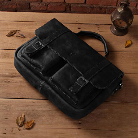
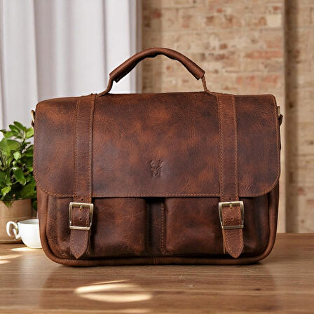


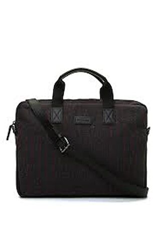


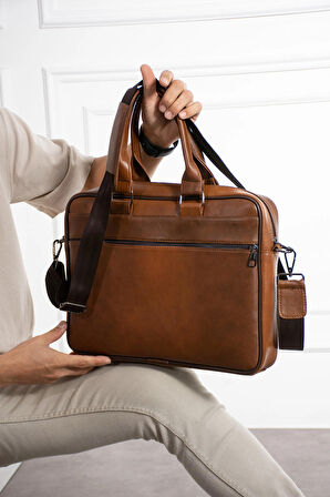


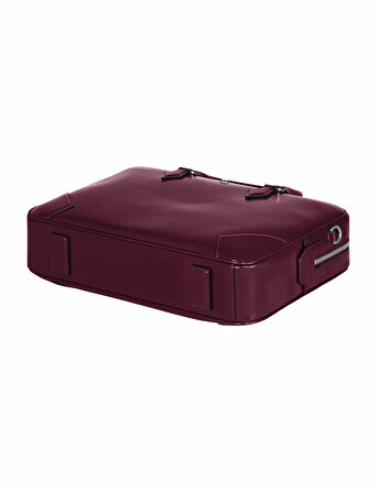
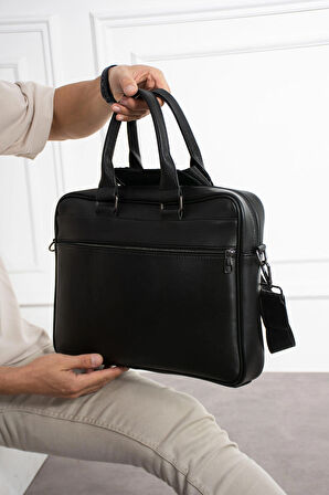


Evrak Çantası
Özellikle ofis ortamında çalışan kadın ve erkeklerin en yaygın kullandığı aksesuarlardan bir tanesi de evrak çantasıdır. Evrak çantaları, kullanışlı yapıları sayesinde ofis ortamında gereksinim duyulan tüm evrakların, kendi içerisinde kategorilere ayrılarak taşınmasına yardımcı olmaktadır. Bununla birlikte içerisinde ek bölmeler bulunan evrak çantaları sadece evraklara değil aynı zamanda çalışanların yanında taşıması gereken diğer eşyaları da depolamak için ek alanlar yaratmaktadır. Bu yönü ile evrak çantaları ofis ortamında çalışanların vazgeçilmez eşyalarından bir tanesidir. İhtiyaç duyulan kapasiteye göre evrak çantaları da değişiklik göstermektedir. Genellikle laptop çantaları ile benzer boyutlarda tasarlanan evrak çantaları kullanıcıların farklı ihtiyaçlarına da yanıt vermek için üretilmektedir. Geçmiş yıllarda tasarlanan evrak çantalarında yalnızca evrak ve dosya gibi eşyaların taşınması için bölgeler bulunurken artık evrak çantasının kapak kısmında ya da iç bölgelerinde bulunan ek kısımlar sayesinde kalem, hesap makinesi ve ihtiyaç duyulan diğer eşyaların da konumlandırılması için özel bölümler yer almaktadır. Ofis ortamında yaşanan ihtiyaçlara uygun evrak çantası seçimi yapmak özellikle uzun dönemde çeşitli dezavantajlar ile karşılaşmamak için oldukça önemlidir. Pazarama.com'da yer alan birbirinden farklı tasarım ve özellikteki evrak çantalarını siz de anlık olarak karşılaştırabilir, kendi ihtiyaçlarınıza uygun modelleri gözden geçirebilirsiniz. Farklı fiyat etiketlerine sahip olan yüzlerce evrak çantası arasından bütçenize uygun modelleri görüntülemek için ise Pazarama.com'da yer alan filtreleme özelliğinden yararlanabilirsiniz. Bu sayede direkt olarak kendi bütçenize uygun modeller arasından bir seçim yapabilirsiniz.
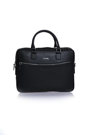
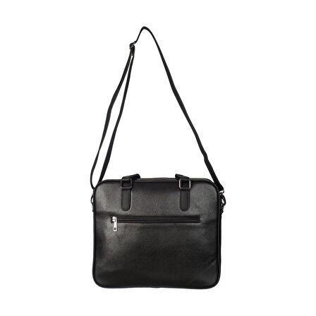
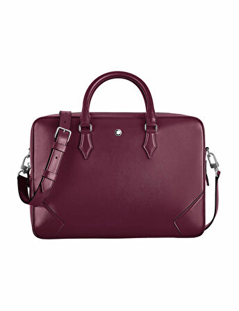
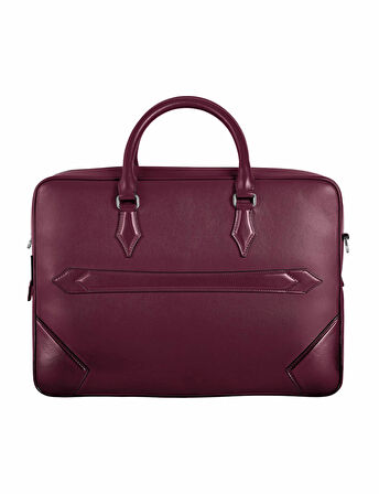
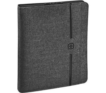
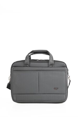
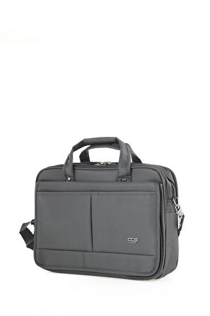
Evrak Çantası Çeşitleri
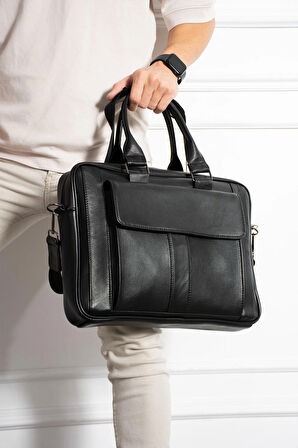
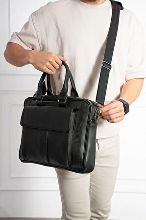
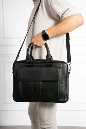
Evrak çantaları özellikle ofis ortamında çalışan kişilerin ihtiyaçlarına yanıt vermek için özel olarak tasarlanmaktadır. Bu çantalar, birçok farklı özellik ve tasarım detayları içermektedir. Günümüz trendlerini de içerisinde barındıran evrak çantaları, fonksiyonel özelliklerinin yanı sıra ofis kıyafetlerinin tamamlayıcı bir aksesuarı olarak da kullanılmaktadır. Her ne kadar kadınların direkt olarak kendi çanta ve aksesuarları bulunuyor olsa da, erkekler için evrak çantaları kullanılan nadir aksesuarlar arasında yer alıyor.
Evrak çantası çeşitleri, kullanım alanına ve evrak çantasına olan beklentilere göre değişiklik göstermektedir. Evrak çantası satın alırken de bu özelliklerin gözden geçirilmesi ve kendinize uygun bir seçimin yapılması gereklidir. Evrak çantası çeşitleri genellikle boyut seçenekleri ve malzeme kalitesi gibi detaylar ile birbirinden ayrılmaktadır. Aynı zamanda evrak çantalarında bulunan ek özellikler de bu çantalar için ayırt edici özellikler arasında yer alıyor.
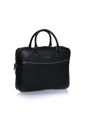
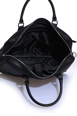
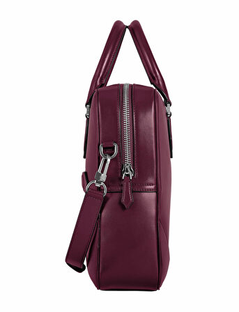
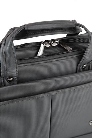
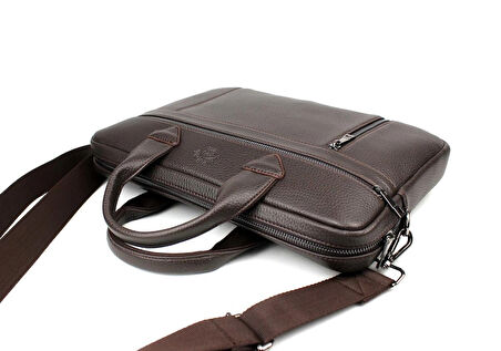
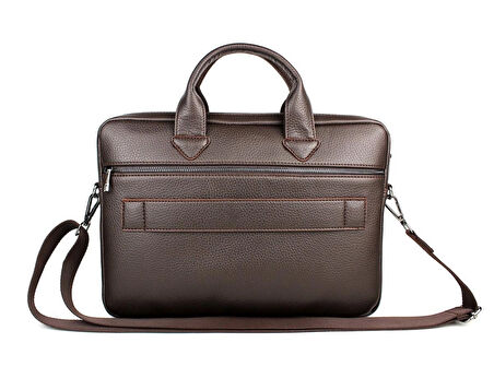
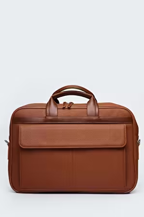
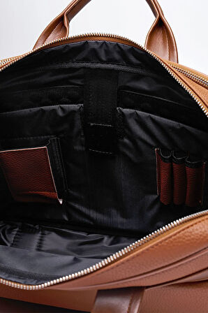
Evrak çantası çeşitleri için bir genelleme yapılamayacak olsa da, bu ürünler için genel bir boyutlandırma mümkündür. Standart boyutlarda tasarlanan evrak çantası çeşitleri, diğerlerinden tasarım detayları ile ayrılmaktadır. Bu tarz evrak çantalarının iç bölümünde, dosya ve benzeri evrakların konumlandırılması için özel bölmeler yer almaktadır. Böylece çanta içerisinde yer alan evrakların hem birbirine karışmaması hem de çanta içerisinde kırılmaması hedeflenmektedir. Evrak çantası içerisinde, ofis ortamında ihtiyaç duyulan evrakların depolanmasının yanı sıra ek aletlerin de taşınması için alanlar oluşturulmaktadır. Hesap makinesi, zımba, ataş, tel ve kalem gibi eşyaların evraklar ile aynı bölmeye yerleştirilmesi, önemli evrakların zarar görmesine neden olabilecek riskleri de beraberinde getirmektedir. Bu nedenle evrak çantalarında bu gibi eşyaların depolanması için ek alanlar bulunmalıdır. Günümüzde tasarlanan evrak çantası çeşitleri ise genelde kapak bölümünün altında bu eşyaların yerleştirilmesi için ek alanlar içermektedir. Kapak bölümü bulunmayan, direkt olarak fermuar ile açılıp kapatılan evrak çantalarında ise evrak çantasının iç kısmında bu eşyalar için ek bölümler yer almaktadır.
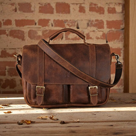
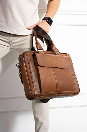
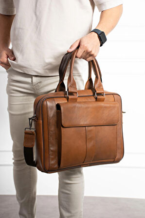
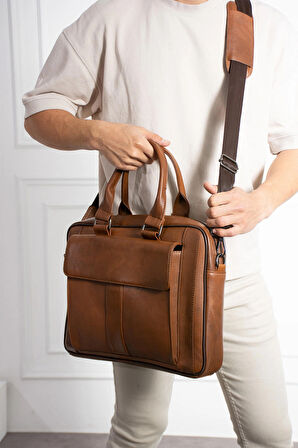
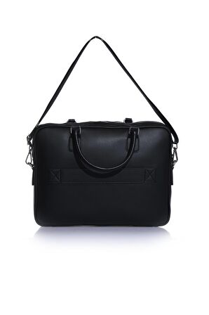
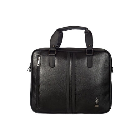
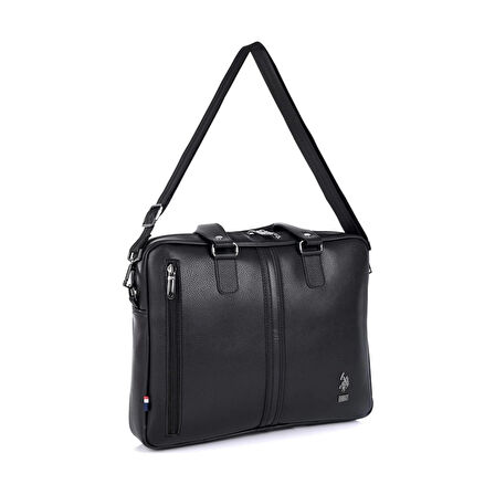
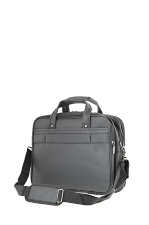
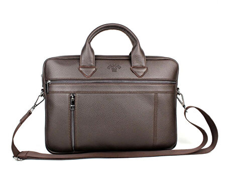
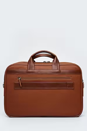
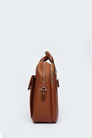
Evrak çantalarında deri, kumaş ve benzeri farklı malzemeler kullanılmaktadır. Deri evrak çantası çeşitleri genellikle daha şık ve klasik tasarımları ile daha fazla tercih edilmektedir. Bu çantaların kullanımı her ne kadar daha yaygın olsa da kumaş ve diğer malzemelerden üretilen evrak çantaları da daha rahat ve spor bir görünüm sunmak için kullanılmaktadır. Evrak çantalarında dikkat edilmesi gereken en büyük detaylar arasında yer alan özelliklerden bir tanesi ise evrak çantalarının su geçirmez özelliği olmasıdır. Yağışlı günlerde ofise yürünmesi gereken durumlarda evrak çantasında yer alan evrakların ıslanmasını ya da zarar görmesini engellemek için su geçirmezlik özelliği oldukça önemlidir. Ancak su geçirmez özelliği bulunan evrak çantalarının diğer evrak çantası çeşitlerine kıyasla daha yüksek fiyatlara sahip olacağı da unutulmamalıdır.
Evrak Çantasının Avantajları
Evrak çantası kullanımı, ofis ortamında çalışan yönetici ve çalışanların en çok kullandığı ve ihtiyaç duyduğu aksesuarlardan bir tanesidir. Bu çantalar, çalışanların önemli evrakları daha güvenli ve düzenli bir ortamda taşıması için oldukça önemlidir. Evrak çantası kullanımının avantajları ise genel olarak şu şekilde ifade edilebilir:
● Evrak çantaları, ofis ortamında daha güvenli şekilde taşınması gereken evrakların, beklenen şekilde taşınmasını sağlamaktadır. Evrak çantası içerisinde yer alan özel bölmeler, evrakların taşınırken zarar görmesini engellemek için oldukça kullanışlıdır.
● Evrak çantaları içerisinde birden fazla bölme bulunmaktadır. Bu sayede evrak çantalarında birbirine karışmaması gereken evraklar, bir arada depolanabilir. Bu evrakların farklı bölmelere konumlandırılması, evrakların karışmaması için yeterlidir.
● Evrak çantaları hem kadın hem de erkekler için ofis kıyafetlerinin tamamlayıcı aksesuarlarından birisidir. Ofis kıyafetleri ile uyumlu evrak çantaları kullanarak siz de kıyafet kombinlerinizi tamamlayabilir, daha dikkat çekici bir tasarıma sahip olabilirsiniz.
● Evrak çantalarında kumaş ya da deri gibi farklı malzemeler kullanılmaktadır. Bu malzemeler kendine göre farklı avantajlar sunuyor olsa da, farklı malzeme seçenekleri kullanıcıların kendi tarzına uygun tasarımları tercih etmesine imkan sağlıyor. Siz de kendi giyim tarzınıza uygun modelleri tercih edebilirsiniz.
Evrak Çantası Fiyatları
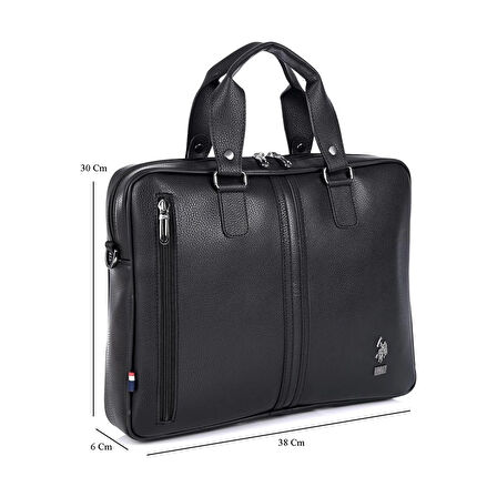
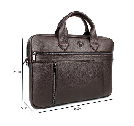
Evrak çantaları için fiyatlar, evrak çantalarının boyutuna, malzemesine ve tasarımına göre değişiklik göstermektedir. Evrak çantası fiyatları genellikle laptop çantaları ile benzer seviyelerdedir. Boyut ve tasarım olarak da laptop çantaları ile benzerlik gösteren bu çantalar, iç tasarım ile birbirinden ayrılmaktadır. Laptop çantalarında genel olarak iki farklı bölüm yer alırken, evrak çantalarında çantanın büyüklüğüne göre daha fazla bölme yer almaktadır. Evrak çantasının iç kısmında yer alan bölme sayısı ve çantanın büyüklüğünün artması ise direkt olarak fiyatların artmasına neden olacaktır. Bu nedenle daha uygun fiyat avantajları elde etmek için mümkün olduğu kadar ihtiyacınız olan kadar bölmeye sahip evrak çantalarını tercih etmeniz gerekiyor.
Evrak çantası fiyatları için belirleyici bir diğer kriter ise çantanın tasarımında kullanılan malzemeler ve çantanın sunduğu ek özelliklerdir. Evrak çantalarında genellikle deri ya da kumaş tercih edilmektedir. Bununla birlikte deri ile aynı görünümü çok daha uygun fiyatlara sunmak için suni deri kullanılan evrak çantaları da bulunuyor. Deri evrak çantası fiyatları genellikle yüksek malzeme kalitesi nedeni ile diğer türlere göre daha yüksektir. Ancak daha şık ve klasik bir görünüm oluşmasına yardımcı olmaktadır. Suni deri de benzer bir görünüm yakalanmasına yardımcı olurken, orijinal deri malzeme ile benzer kullanım ömrüne sahip değildir.
Özellikle son yıllarda gelişen teknoloji ile birlikte, evrak çantalarında yaygın olarak kullanılan kumaş malzeme ise su geçirmezlik ve benzeri birçok avantajı ile tercih ediliyor. Bununla birlikte su geçirmez özelliği bulunmayan kumaş evrak çantası fiyatları da ofis ihtiyaçlarını daha uygun fiyatlar ile karşılamak isteyen kişiler tarafından tercih edilmektedir.