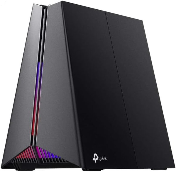
Tp-Link Archer Ge550 | Wi-Fi 7 Gaming Router | 9300 Mbps Hız | Üç Bant | 5G/2.5G Port | Easymesh | M
TP-Link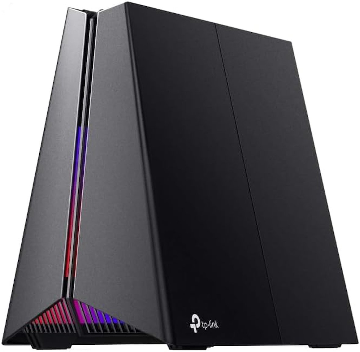
Tüm Ürün Açıklamasını Gör
29.804,99 TL
Sepette
28.314,75 TL


Ürün Açıklaması
Özellikler ve Spesifikasyonlar: Özellikleri: Ebeveyn Kontrolü, Erişim Noktası Modu, LED Göstergesi, Misafir Modu, QoS, İnternet Güvenliği, Ek Yazıcı İşlevleri: Üç Bant, Kablosuz İletişim Standardı: 802.11.be, Uyumlu Cihazlar: Akıllı Telefon, Ürün İçin Önerilen Kullanım Alanları: Oyun, Bağlantı Teknolojiisi: Wi-Fi, Anten Türü: Dahili, Güvenlik Protokolü: WPA3, Port Sayısı: 5, Kontrol Yöntemi: Uygulama, Veri Aktarım Hızı: 9300 Saniyede Megabit, Voltaj: 12 Volt, Maksimum Yukarı Yönde Veri Aktarım Hızı: 4650 Megabit/Saniye, Wi-Fi Jenerasyonu: Wi-Fi 7, Modem Uyumlu mu?: Hayır, Bağlantı Protokolü: Wi-Fi, Kapsama: Ev içi, Kumanda Türü: Uygulama Denetimi, Frekans: 5 GHz. Ölçümler: Ürünün Ağırlığı: 450 Gram Cihazlarınız İçin Daha Yüksek Hızlar: 6 GHz, 5 GHz ve 2.4 GHz bantlarını aynı anda kullanan Multi-Link Operation (MLO) teknolojisi sayesinde internet bağlantınız kararlı olur ve veri aktarımı verimli gerçekleşir; böylece çevrim içi oyun deneyiminiz zirveye ulaşır. Esnek Ağ Portu Yapılandırmaları: 1× 5 Gbps WAN portu, 1× 5 Gbps LAN portu ve 3× 2.5 Gbps LAN portuyla Archer GE550 maksimum esneklik ve yüksek veri aktarım hızı sunar. Bu yapılandırmalar, kablolu oyun cihazları için devasa bant genişliği ve ultra hızlı bağlantılar sağlar. Oyunlara Özel Hızlandırma: Oyun uygulamalarını, oyun cihazlarını, mobil oyunları ve oyun sunucularını hızlandırır. Bağlantıyı sabitler, gecikme, takılma ve ping süresini en aza indirirken hızı artırır. Özel Oyun Paneli: Sezgisel oyun paneli, savaş ortamı, ağ durumu, yönlendirici performansı, RGB ayarları, hızlandırılmış oyunlar ve donanımlar hakkında gerçek zamanlı bilgi sunarak oyuncuların strateji geliştirmesini sağlar Oyun Tarzı Tasarım: Volkan temalı tasarımıyla oyun tutkusunu alevlendirir. Özelleştirilebilir RGB aydınlatmasıyla Archer GE550, her oyuncu alanının şık odak noktası olur. TP-Link HomeShield: HomeShield, güvenli bir oyun deneyimi için güçlü antivirüs koruması sağlar. Tüm cihazlarınızı ve kişisel verilerinizi çevrimiçi tehditlere karşı savunarak oyun sırasında içinizin rahat olmasını sağlar. EasyMesh Uyumluluğu: EasyMesh yönlendiriciler ve menzil genişleticilerle çalışarak kesintisiz bütün ev Mesh WiFi ağı oluşturur. Bu bağlantı, istikrarlı kapsama alanı sağlayarak oyuncuların takım oyunlarında üstünlük kurmasına yardımcı olur.
.aplus-v2 .aplus-content-wrapper {
position: relative;
overflow: hidden;
}
.aplus-v2 .container-with-background-image {
width: 100%;
height: 100%;
background-repeat: no-repeat;
background-size: cover;
}
function logShoppableMetrics(moduleName, showsAddToCart) {
if (window.ue && window.ue.count) {
window.ue.count("aplus:shoppable:" + moduleName + ":addToCart", showsAddToCart ? 1 : 0);
}
}
Markadan
/*
* Used when device = desktop
* Configured in: configuration/brazil-config/global/brand-story.cfg
*/
/* Because the carousel is implemented as an ol list,
any lists in the card text will have a secondary list style (letters).
This will give an incorrect appearance to viewers,
so we set all lists to the primary list style (numbers). */
.aplus-brand-story-card ol li {
list-style: decimal;
}
/* Top level containers */
.aplus-module .apm-brand-story-hero {
-moz-box-sizing: border-box;
-webkit-box-sizing: border-box;
box-sizing: border-box;
width: 1464px;
height: 625px;
background-color: #fff;
}
.aplus-module .apm-brand-story-card {
-moz-box-sizing: border-box;
-webkit-box-sizing: border-box;
box-sizing: border-box;
width: 362px;
height: 453px;
background-color: #fff;
}
.apm-brand-story-hero,
.apm-brand-story-card {
-moz-box-sizing: border-box;
-webkit-box-sizing: border-box;
box-sizing: border-box;
position: relative;
width: 100%;
height: 100%;
float: none;
}
.aplus-module.brand-story-card-1-four-asin .apm-brand-story-card {
/* Only 12px to account for image cell border */
padding: 12px;
}
/* Full background image (Hero 1 & Card 2) */
.aplus-module .apm-brand-story-background-image {
-moz-box-sizing: border-box;
-webkit-box-sizing: border-box;
box-sizing: border-box;
overflow: hidden;
position: absolute;
width: 100%;
height: 100%;
}
.aplus-module .apm-brand-story-background-image img {
display: block;
width: 100%;
height: 100%;
object-fit: cover;
}
/* Card 1 small images */
.aplus-module .apm-brand-story-image-grid {
-moz-box-sizing: border-box;
-webkit-box-sizing: border-box;
box-sizing: border-box;
padding: 0px;
margin: auto;
display: flex;
flex-flow: row wrap;
}
.aplus-module .apm-brand-story-image-grid .apm-brand-story-image-grid-item {
/* Use content-box to ensure image size matches editor schema */
-moz-box-sizing: content-box;
-webkit-box-sizing: content-box;
box-sizing: content-box;
padding: 0px;
margin: 2px;
width: 162px;
height: 185px;
border: 1px solid #fff;
}
.aplus-module .apm-brand-story-image-grid .apm-brand-story-image-grid-item .apm-brand-story-image-link {
display: block;
width: 100%;
height: 100%;
padding: 2px;
}
.aplus-module .apm-brand-story-image-grid .apm-brand-story-image-grid-item .apm-brand-story-image-link .apm-brand-story-image-img {
display: block;
width: 100%;
height: 100%;
object-fit: cover;
}
/* Card 3 logo image */
.aplus-module .apm-brand-story-logo-image {
-moz-box-sizing: content-box;
-webkit-box-sizing: content-box;
box-sizing: content-box;
height: 145px;
margin: 0px 4px;
padding: 20px;
padding-bottom: 0px;
}
/* Text overlays */
.aplus-module .apm-brand-story-text-bottom {
-moz-box-sizing: border-box;
-webkit-box-sizing: border-box;
box-sizing: border-box;
position: absolute;
bottom: 13px;
left: 13px;
}
.aplus-module .apm-brand-story-hero .apm-brand-story-text-bottom {
background-color: rgba(0,0,0,0.6);
color: #fff;
padding: 13px 65px 13px 13px; /* accounts for overlap of first card */
width: 437px;
}
.aplus-module.brand-story-card-2-media-asset .apm-brand-story-text-bottom {
background-color: rgba(255,255,255,0.6);
color: #000;
padding: 13px;
width: 336px;
}
.aplus-module.brand-story-card-1-four-asin .apm-brand-story-text {
margin-top: 8px;
padding-left: 2px;
padding-right: 2px;
}
.aplus-module.brand-story-card-1-four-asin .apm-brand-story-text.apm-brand-story-text-single {
margin-top: 20px;
}
.aplus-module.brand-story-card-1-four-asin .apm-brand-story-text h3 {
white-space: nowrap;
overflow: hidden;
text-overflow: ellipsis;
}
.aplus-module .apm-brand-story-slogan-text {
-moz-box-sizing: content-box;
-webkit-box-sizing: content-box;
box-sizing: content-box;
margin: 0px 4px;
padding: 20px;
}
.aplus-module .apm-brand-story-faq {
-moz-box-sizing: content-box;
-webkit-box-sizing: content-box;
box-sizing: content-box;
padding-top: 10px;
}
.aplus-module .apm-brand-story-faq-block {
margin: 0px 10px;
padding: 10px;
}
.aplus-v2 .apm-brand-story-carousel-container {
position: relative;
}
.aplus-v2 .apm-brand-story-carousel-hero-container,
.aplus-v2 .apm-brand-story-carousel-hero-container > div {
position: absolute;
width: 100%;
}
/*
Ensuring the carousel takes only the space it needs.
The sizes need to be set again on the absolutely positioned elements so they can take up space.
*/
.aplus-v2 .apm-brand-story-carousel-container,
.aplus-v2 .apm-brand-story-carousel-hero-container {
height: 625px;
width: 100%;
max-width: 1464px;
margin-left: auto;
margin-right: auto;
overflow: hidden;
}
.aplus-v2 .apm-brand-story-carousel-hero-container,
.aplus-v2 .apm-brand-story-carousel-hero-container > div {
height: 625px;
}
.aplus-v2 .apm-brand-story-carousel.a-carousel-container {
padding: 0px;
}
/*
This centers the carousel vertically on top of the hero image container and after the logo area (125px).
Margin-top = (heroHeight - cardHeight - logoAreaHeight) / 2 + logoAreaHeight
*/
.aplus-v2 .apm-brand-story-carousel .a-carousel-row-inner {
margin-top: 149px;
}
/*
Cards need to have a width set, otherwise they default to 50px or so.
All cards must have the same width. The carousel will resize itself so all cards take the width of the largest card.
The left margin is for leaving a space between each card.
*/
.aplus-v2 .apm-brand-story-carousel .a-carousel-card {
width: 362px;
margin-left: 30px !important;
}
/* styling the navigation buttons so they are taller, flush with the sides, and have a clean white background */
.aplus-v2 .apm-brand-story-carousel .a-carousel-col.a-carousel-left,
.aplus-v2 .apm-brand-story-carousel .a-carousel-col.a-carousel-right {
padding: 0px;
}
.aplus-v2 .apm-brand-story-carousel .a-carousel-col.a-carousel-left .a-button-image,
.aplus-v2 .apm-brand-story-carousel .a-carousel-col.a-carousel-right .a-button-image {
border: none;
margin: 0px;
}
.aplus-v2 .apm-brand-story-carousel .a-carousel-col.a-carousel-left .a-button-image .a-button-inner,
.aplus-v2 .apm-brand-story-carousel .a-carousel-col.a-carousel-right .a-button-image .a-button-inner {
background: #fff;
padding: 20px 6px;
}
.aplus-v2 .apm-brand-story-carousel .a-carousel-col.a-carousel-left .a-button-image .a-button-inner {
border-radius: 0px 4px 4px 0px;
}
.aplus-v2 .apm-brand-story-carousel .a-carousel-col.a-carousel-right .a-button-image .a-button-inner {
border-radius: 4px 0px 0px 4px;
}
Previous page
Wi-Fi 7
Mesh