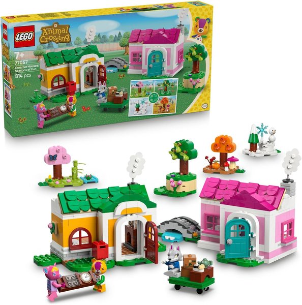
Lego Animal Crossing Yaratıcı Evler: Eğlenceli Mevsimler 77057 – 7+ Yaş Kız Ve Erkek Çocuklar Için M
Lego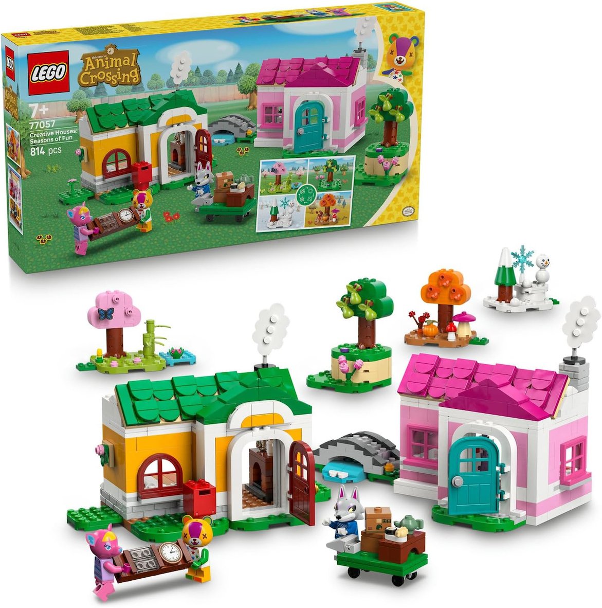
Tüm Ürün Açıklamasını Gör
6.010,99 TL
Sepette
5.710,45 TL


Ürün Açıklaması
Hayvan minifigürlü ev yapma seti – 7 yaş ve üzeri doğa tutkunları için tasarlanan bu yaratıcı yapım seti, hayal gücünü destekleyen çok sayıda aksesuarla ev yapma ve dekorasyon eğlencesi sunar Sevimli figürlü oyuncak seti – Oyuncak ayı, geyik ve kurt figürleriyle gelen bu set, minifigürlerle hayvan temalı oyunlar oynamak isteyen çocuklara eğlenceli ve yaratıcı oyun fırsatları sağlar Kişiselleştirilebilir yapım oyuncağı – Her biri farklı mobilyalar ve aksesuarlarla donatılmış iki ev, üst üste veya yan yana dizilebilir; dört mevsime özel modüllerle evler sürekli yeniden tasarlanabilir Rol yapma hikayeleri için oyun evi – Her figürün kendine ait mobilyaları ve taşıma arabasıyla oynanabilen sahneler, çocukların yaratıcı düşünmelerini ve aktif rol oyunlarını destekler Ekran dışı hayal gücü oyuncağı – Yapım parçalarıyla ev dizayn etmeyi seven kız ve erkek çocuklara yönelik bu set, hayal gücünü geliştirirken mevsimsel hikayeler oluşturma eğlencesi de sunar Seriye özel genişletilebilir oyun dünyası – Ekran başında geçen zamanın ötesine geçmek isteyen çocuklar için, bu set serinin diğer parçalarıyla birlikte kombinlenerek daha büyük hikayelere kapı aralar Uygulamayla desteklenen dijital deneyim – Ücretsiz Builder uygulaması sayesinde çocuklar modelleri döndürebilir, yakınlaştırabilir, ilerlemeyi takip edebilir ve sezgisel bir yapım yolculuğu yaşayabilir
Markadan
.aplus-v2 .container-with-background-image {
width: 100%;
height: 100%;
background-repeat: no-repeat;
background-size: cover;
}
function logShoppableMetrics(moduleName, showsAddToCart) {
if (window.ue && window.ue.count) {
window.ue.count("aplus:shoppable:" + moduleName + ":addToCart", showsAddToCart ? 1 : 0);
}
}
/*
* Used when device = desktop
* Configured in: configuration/brazil-config/global/brand-story.cfg
*/
/* Because the carousel is implemented as an ol list,
any lists in the card text will have a secondary list style (letters).
This will give an incorrect appearance to viewers,
so we set all lists to the primary list style (numbers). */
.aplus-brand-story-card ol li {
list-style: decimal;
}
/* Top level containers */
.aplus-module .apm-brand-story-hero {
-moz-box-sizing: border-box;
-webkit-box-sizing: border-box;
box-sizing: border-box;
width: 1464px;
height: 625px;
background-color: #fff;
}
.aplus-module .apm-brand-story-card {
-moz-box-sizing: border-box;
-webkit-box-sizing: border-box;
box-sizing: border-box;
width: 362px;
height: 453px;
background-color: #fff;
}
.apm-brand-story-hero,
.apm-brand-story-card {
-moz-box-sizing: border-box;
-webkit-box-sizing: border-box;
box-sizing: border-box;
position: relative;
width: 100%;
height: 100%;
float: none;
}
.aplus-module.brand-story-card-1-four-asin .apm-brand-story-card {
/* Only 12px to account for image cell border */
padding: 12px;
}
/* Full background image (Hero 1 & Card 2) */
.aplus-module .apm-brand-story-background-image {
-moz-box-sizing: border-box;
-webkit-box-sizing: border-box;
box-sizing: border-box;
overflow: hidden;
position: absolute;
width: 100%;
height: 100%;
}
.aplus-module .apm-brand-story-background-image img {
display: block;
width: 100%;
height: 100%;
object-fit: cover;
}
/* Card 1 small images */
.aplus-module .apm-brand-story-image-grid {
-moz-box-sizing: border-box;
-webkit-box-sizing: border-box;
box-sizing: border-box;
padding: 0px;
margin: auto;
display: flex;
flex-flow: row wrap;
}
.aplus-module .apm-brand-story-image-grid .apm-brand-story-image-grid-item {
/* Use content-box to ensure image size matches editor schema */
-moz-box-sizing: content-box;
-webkit-box-sizing: content-box;
box-sizing: content-box;
padding: 0px;
margin: 2px;
width: 162px;
height: 185px;
border: 1px solid #fff;
}
.aplus-module .apm-brand-story-image-grid .apm-brand-story-image-grid-item .apm-brand-story-image-link {
display: block;
width: 100%;
height: 100%;
padding: 2px;
}
.aplus-module .apm-brand-story-image-grid .apm-brand-story-image-grid-item .apm-brand-story-image-link .apm-brand-story-image-img {
display: block;
width: 100%;
height: 100%;
object-fit: cover;
}
/* Card 3 logo image */
.aplus-module .apm-brand-story-logo-image {
-moz-box-sizing: content-box;
-webkit-box-sizing: content-box;
box-sizing: content-box;
height: 145px;
margin: 0px 4px;
padding: 20px;
padding-bottom: 0px;
}
/* Text overlays */
.aplus-module .apm-brand-story-text-bottom {
-moz-box-sizing: border-box;
-webkit-box-sizing: border-box;
box-sizing: border-box;
position: absolute;
bottom: 13px;
left: 13px;
}
.aplus-module .apm-brand-story-hero .apm-brand-story-text-bottom {
background-color: rgba(0,0,0,0.6);
color: #fff;
padding: 13px 65px 13px 13px; /* accounts for overlap of first card */
width: 437px;
}
.aplus-module.brand-story-card-2-media-asset .apm-brand-story-text-bottom {
background-color: rgba(255,255,255,0.6);
color: #000;
padding: 13px;
width: 336px;
}
.aplus-module.brand-story-card-1-four-asin .apm-brand-story-text {
margin-top: 8px;
padding-left: 2px;
padding-right: 2px;
}
.aplus-module.brand-story-card-1-four-asin .apm-brand-story-text.apm-brand-story-text-single {
margin-top: 20px;
}
.aplus-module.brand-story-card-1-four-asin .apm-brand-story-text h3 {
white-space: nowrap;
overflow: hidden;
text-overflow: ellipsis;
}
.aplus-module .apm-brand-story-slogan-text {
-moz-box-sizing: content-box;
-webkit-box-sizing: content-box;
box-sizing: content-box;
margin: 0px 4px;
padding: 20px;
}
.aplus-module .apm-brand-story-faq {
-moz-box-sizing: content-box;
-webkit-box-sizing: content-box;
box-sizing: content-box;
padding-top: 10px;
}
.aplus-module .apm-brand-story-faq-block {
margin: 0px 10px;
padding: 10px;
}
.aplus-v2 .apm-brand-story-carousel-container {
position: relative;
}
.aplus-v2 .apm-brand-story-carousel-hero-container,
.aplus-v2 .apm-brand-story-carousel-hero-container > div {
position: absolute;
width: 100%;
}
/*
Ensuring the carousel takes only the space it needs.
The sizes need to be set again on the absolutely positioned elements so they can take up space.
*/
.aplus-v2 .apm-brand-story-carousel-container,
.aplus-v2 .apm-brand-story-carousel-hero-container {
height: 625px;
width: 100%;
max-width: 1464px;
margin-left: auto;
margin-right: auto;
overflow: hidden;
}
.aplus-v2 .apm-brand-story-carousel-hero-container,
.aplus-v2 .apm-brand-story-carousel-hero-container > div {
height: 625px;
}
.aplus-v2 .apm-brand-story-carousel.a-carousel-container {
padding: 0px;
}
/*
This centers the carousel vertically on top of the hero image container and after the logo area (125px).
Margin-top = (heroHeight - cardHeight - logoAreaHeight) / 2 + logoAreaHeight
*/
.aplus-v2 .apm-brand-story-carousel .a-carousel-row-inner {
margin-top: 149px;
}
/*
Cards need to have a width set, otherwise they default to 50px or so.
All cards must have the same width. The carousel will resize itself so all cards take the width of the largest card.
The left margin is for leaving a space between each card.
*/
.aplus-v2 .apm-brand-story-carousel .a-carousel-card {
width: 362px;
margin-left: 30px !important;
}
/* styling the navigation buttons so they are taller, flush with the sides, and have a clean white background */
.aplus-v2 .apm-brand-story-carousel .a-carousel-col.a-carousel-left,
.aplus-v2 .apm-brand-story-carousel .a-carousel-col.a-carousel-right {
padding: 0px;
}
.aplus-v2 .apm-brand-story-carousel .a-carousel-col.a-carousel-left .a-button-image,
.aplus-v2 .apm-brand-story-carousel .a-carousel-col.a-carousel-right .a-button-image {
border: none;
margin: 0px;
}
.aplus-v2 .apm-brand-story-carousel .a-carousel-col.a-carousel-left .a-button-image .a-button-inner,
.aplus-v2 .apm-brand-story-carousel .a-carousel-col.a-carousel-right .a-button-image .a-button-inner {
background: #fff;
padding: 20px 6px;
}
.aplus-v2 .apm-brand-story-carousel .a-carousel-col.a-carousel-left .a-button-image .a-button-inner {
border-radius: 0px 4px 4px 0px;
}
.aplus-v2 .apm-brand-story-carousel .a-carousel-col.a-carousel-right .a-button-image .a-button-inner {
border-radius: 4px 0px 0px 4px;
}
Previous page
Çok Satanlar Mağazayı ziyaret edin
Yaşa Göre Alışveriş Mağazayı ziyaret edin
Temaya Göre Alışveriş Mağazayı ziyaret edin
Ürün Özellikleri
Renk
Çok Renkli